

Think of a perfect coral sunrise. Now think of the smell of your favorite place. Chances are you felt something before you could explain it: warmth, calm, a little lift in your chest.
Color and scent have this in common: they reach us before we think. They don't need translating. And when they arrive together, the effect can be even stronger. So what does the research actually say about how color and scent shape emotion? Here's what we found, and how we used it.

Why color and scent shape how we feel
Researchers have been studying the link between the senses and emotion for a long time. A few findings help explain why this works.
Colors carry meaning, partly learned and partly instinctive. In a review of decades of research, psychologist Andrew Elliot describes how color can influence how people feel and behave, and why the effect depends heavily on context. The same shade can mean something different on a warning sign than it does on a bouquet. Some associations seem to come from nature (think of the warmth of a sunrise), while others come from culture and experience.
Scents and colors seem to belong together. In studies on what scientists call "crossmodal correspondences", people consistently match certain fragrances with certain colors. Research by Schifferstein and Tanudjaja (2004) suggested that emotion plays a key role in these matches: we tend to pair a scent and a color that make us feel similar things, and more pleasant scents are matched with more consistent colors. Other work, such as a 2012 study by Spector and Maurer, found that some pairings are rooted in experience (lemon and yellow is the classic example), while others are harder to explain by experience alone.
Context matters. Neither color nor scent works like a switch. Memories, culture and personal history all change the response. That is why we talk about designing for a feeling rather than promising a result: the aim is a sensory moment you can recognize and enjoy.

How specific colors and scents are often associated with feelings
Without overstating the science, some pairings come up again and again:
- Yellow and citrus are commonly linked with light, energy and optimism.
- Deep blues and greens tend to suggest depth, calm and freshness.
- Warm reds, burgundy and pinks are often tied to warmth, intimacy and the senses.
- Soft peach and floral notes are widely read as gentle and comforting.
- Herbs and green notes often evoke clarity and balance.
These are tendencies, not rules. But they make a useful starting point for anyone designing a sensory experience.

Putting it into practice: Chromessence
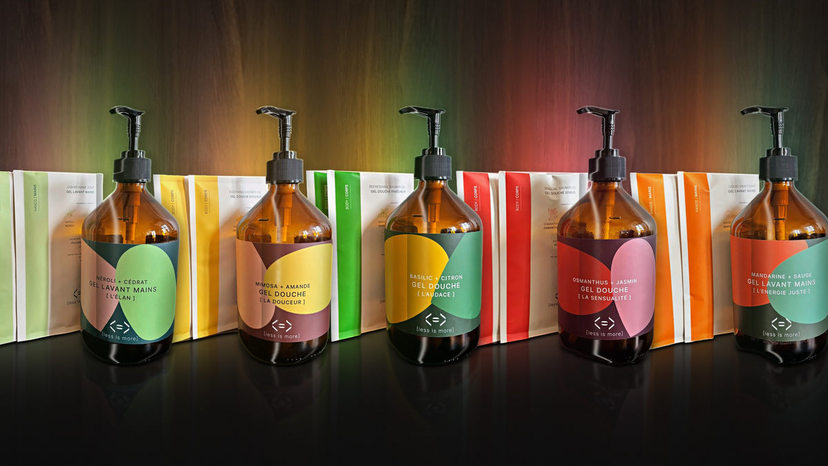
This is the idea behind our Chromessence collection, five limited-edition shower gels and hand soaps where color, scent and emotion are designed to meet. Each bottle starts with a feeling. We then chose a scent and a palette that express it.
Boldness: Basil + Lemon. Deep blue-green, sunny yellow and botanical green. Fresh energy and the freedom to create your own path. Freedom begins the day we choose to create our own path.

Softness: Mimosa + Almond. Burgundy, golden yellow and soft peach. Warmth and kindness toward yourself, a gentle feeling with quiet strength. Being gentle with yourself is a quiet strength that changes everything.

Sensuality: Osmanthus + Jasmine. Burgundy, warm red and tender pink. An invitation to slow down, awaken your senses and feel life against your skin. Sensuality begins when we slow down enough to feel life brush against the skin.

Momentum: Neroli + Citron. Deep teal, pale green and peach. A spark of light and renewal, the feeling of possibility stirring again. Sometimes, a spark of light is enough to set possibility in motion.

Balanced Energy: Mandarin + Sage. Deep green, vibrant orange and sage. Strength and calm together, the energy to move forward while staying centered. Moving forward with strength without losing your centre: this is balanced energy.

A small moment, made memorable
We think the best rituals are the ones you notice. A bottle in a color you love, a fragrance that stops you for a second, a daily moment that feels a little more like yours. Placed in your bathroom, each Chromessence bottle is meant to be seen as much as it is used: a visual moment that matches the scent.
They also make a thoughtful holiday gift, or a keepsake to treat yourself.
Discover the Chromessence collection and find the feeling you want to start your day with.
Sources
- Elliot, A. J. (2015). Color and psychological functioning: a review of theoretical and empirical work. Frontiers in Psychology.
- Schifferstein, H. N. J., & Tanudjaja, I. (2004). Visualising fragrances through colours: the mediating role of emotions.
- Spector, F., & Maurer, D. (2012). Making sense of scents: the colour and texture of odours.
- Spence, C. (2020). Scented colours (review of odor-color correspondences).
Chromessence is a limited edition, holiday 2026. Powder-to-liquid formulas, 99% natural origin*. *Percentage of ingredients of natural origin.






Leave a comment
This site is protected by hCaptcha and the hCaptcha Privacy Policy and Terms of Service apply.